


This quilt has been an adventure in discomfort for me. Everything from the minimal design to the swirly quilting was a creative stretch, and I'm pretty pleased with the result. Because of this, I decided to name this quilt Dabbling.
The rainbow of solids just glow against that gray background. Amazingly, when I edited these photos, I did not saturate the colors in these photographs at all. The hues are just this vibrant. I also love how the gray shot cotton adds some dimension to the quilt, but is still solid. This is a Cloud 9 fabric from their Cirrus line called Shadow. It is woven with two shades of gray, so the "shimmery" quality that shot cotton usually gives is very subtle. It is a really soft fabric, and I found it easy to work with, though it does ravel a little more than others.

I did a good bit of sketching and practice quilting on those swirls before finally getting up enough nerve to put them on the quilt, but no matter how much you practice, creating the design on a quilt always feels a little different because of the weight involved. Once I put that quilt under the needle, I had to fight my stippling autopilot the entire time. Muscle memory really is an amazing thing. When I started, I knew that there was NO way that I would be able to keep the swirls the same size throughout the quilt, so I purposely varied the sizes from the get-go. These swirls are far from perfect, but overall, I'm happy with them for a first attempt. (ps- that is not a pucker on the gray fabric in the upper right; it is a wrinkle that will wash right out; the sunshine is just throwing it into great relief).
So, my reasoning for branching out from a simple stipple is because, with all of that negative space, I wanted to call a little more attention to the quilting. Though I always love the texture and dimension that quilting creates, in general, I tend to focus more on color, fabric, and the pattern design. That being said, this is definitely not the last time that swirls will be appearing on one of my quilts.

You wouldn't know this from looking at my quilts, but I kind of have a thing for birds. I have a couple of pieces of art in my home that have songbirds in them, and when I decorate my Christmas trees, I clip blown-glass birds with feather tails all over them. Anything can be overdone, so although I am drawn to things with birds on them, my home does not have birds everywhere. I just think they look delicate and pretty.
When I was searching for a backing fabric, I knew I wanted a fantastically busy print with a rainbow of colors, since the front was so minimal. I found this Michael Miller print and fell in love. The folk drawn birds are the perfect foil to the front of the quilt, and the dark navy background balances the expanse of lighter gray perfectly. I don't usually gravitate toward fabrics with animals in them (not even Cotton and Steel or Tula Pink), but I cannot tell you how much I love this print.
I simply can't make a backing without piecing a little bit, so I added a wide stripe of the turquoise solid. Also, since this fabric is directional, the solid stripe also allowed me to avoid having any seams in the birds. Each bird is about 3-4 inches tall. Aren't they just SO much fun?

I chose to put a rainbow binding on this quilt, using each of the solids, and it really pops against both the front and back of the quilt. Two binding joins fell in the corners though. grrr....
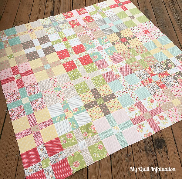
In case you missed my last post, this quilt is made using my Girl's Best Friend pattern, but I just made ten blocks. Since a few have asked, I won't be writing a separate pattern for this minimal layout, so if you want the specific details on modifying the pattern, just shoot me an email, and I'm happy to help! This quilt is 60" square.

So here's the honest to goodness truth. Do I love this quilt as much as other quilts that are much more "me," like Stems and Stones, or Seeing Double? Nope, but I've learned that's okay. I had fun pushing the boundaries of my creativity on this quilt, and doing that has inspired me to dabble in a little design discomfort in the future (like maybe other FMQ designs- gasp!). After all, the process and journey are just as valuable as the end product.